Background
The Virtual Reality Club at UCSD is a student organization who's mission is to spread awareness and educate members of its community about virtual and augmented reality. Founded in 2015, I came on board during the start of their second year after having been a member of the organization myself. As the organization's first-ever Branding Chair, I had the task of developing the brand including a logo, branding strategy, and all media needed for advertising events and communication.
The starting point
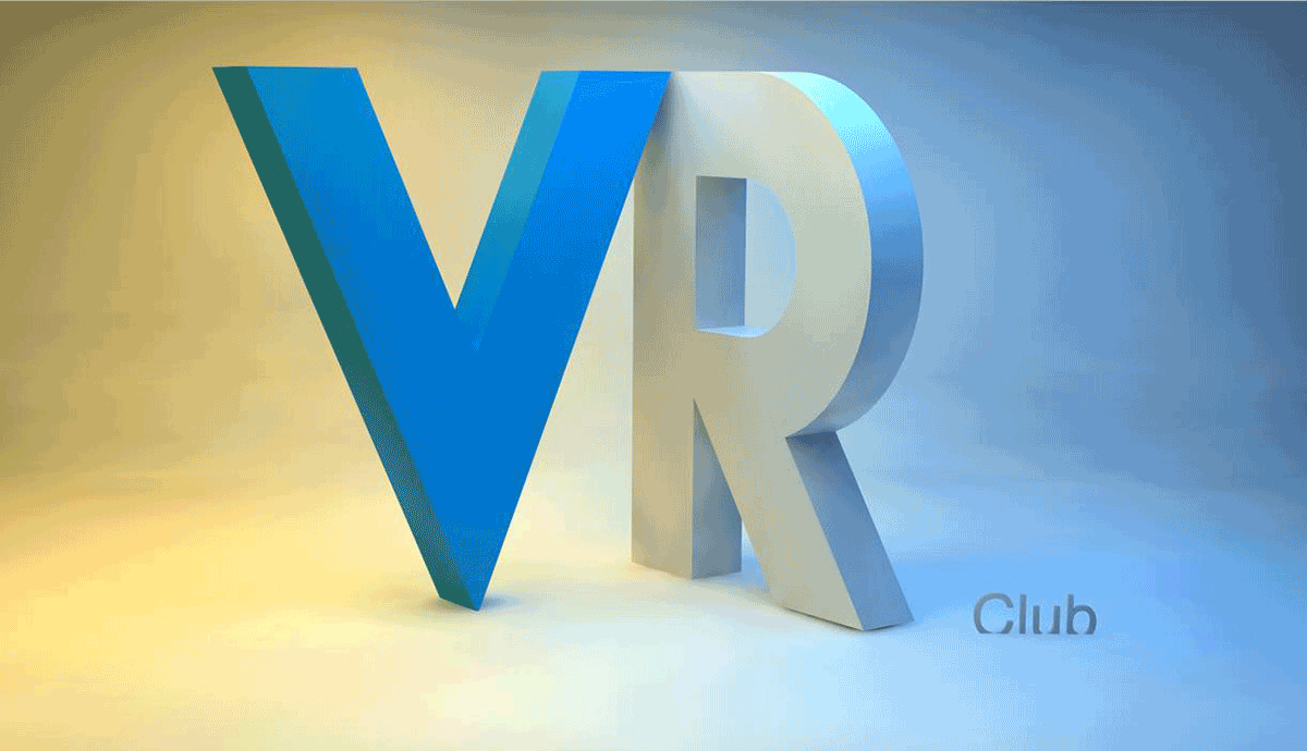
For the first year of its run, the organization used a 3D rendered logo which was....good for a laugh. (I secretly love it, and reminded everyone of its existence every chance I had.)

Brand
Inspiration
Given the medium of virtual reality, bringing in some roots of the dimensionality of the organization was important. To tie into other mediums which came before, the colors for the organization were chosen based off the 3D anaglyph glasses we all know and love.
The club had two primary colors, red and cyan, based off the anaglyph glasses. I employed the use of two primaries in order to brand the two main directions of the organization; social and technical. These colors contrast one another a great deal, this meant controlling the temperature of the colors (making the red slightly more blue) to get them to feel more cohesive. Additionally, I mean'd the two colors to find an intermediate color which bridges them conceptually and literally. Gold was also introduced as a accent in order to tie in the campus who's brand colors are blue and gold.

Logo
I developed the logo through trying to determine what would allow for people to understand the purpose of the organization, being it is about virtual reality, and the root of being a UCSD organization.

The settled on logo used the letters VR in a ribbon-like, folded representation. After the prototyping of several designs including Triton (the mascot of UCSD) wearing a headset in different iterations to other, typographic representations of the VR, it became clear that due to the lack of virtual reality awareness at the time, non-vr enthusiasts might not interpret the headset. The decided logo blends together all keys factors of the organization, important to the deciding body, as well as my own desire to try and develop a light-hearted, yet refined brand.
Banners, Posters, + Packets
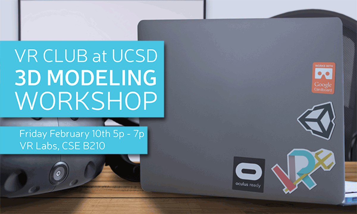
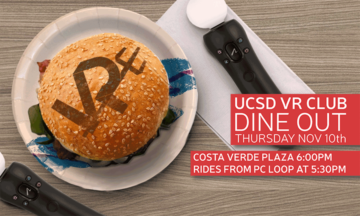
As it developed into graphic designs, the use of two primary colors for the organization allowed for the branding of the two missions; 'community and education', which were categorized into 'technical and social.'

Cyan; Workshops, Talks, Demos

Red; Socials
When it came to referencing the organization as a whole, both colors were used, employing a gradient aesthetic.

organization leadership
Along with all the work I did within my role developing the graphical representation of the organization, I also helped develop the environment for new leaders and members to join and make an impact on the direction.
Leadership
Over the two years which I was apart of the organization, I helped grow the body of leaders from our initial group of 8 to a team of over 25 through recruitment, interviews, and on boarding of new members. As an executive member, I was involved in the growth of all divisions of the organization. Through my direction, I grew the branding branch of the organization into a team of around 10 individuals including designs, developers, and our historian.
Outreach
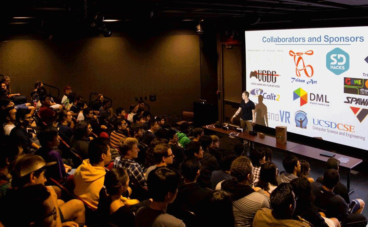
Throughout my time with the organization, I had the opportunity to help, as part of the leadership, with the collaboration and execution of events with San Diego-based organization. This led us to collaborations with several schools (La Jolla Country Day School and Claremont Mesa High School) providing equipment and experiences to promote positive uses of virtual reality. Additionally, we worked together with the San Diego Zoo for a tech night they put together, as well as an art gallery in the heart of downtown San Diego emphasizing future technologies.
